
Go back
Geo-Anatomy
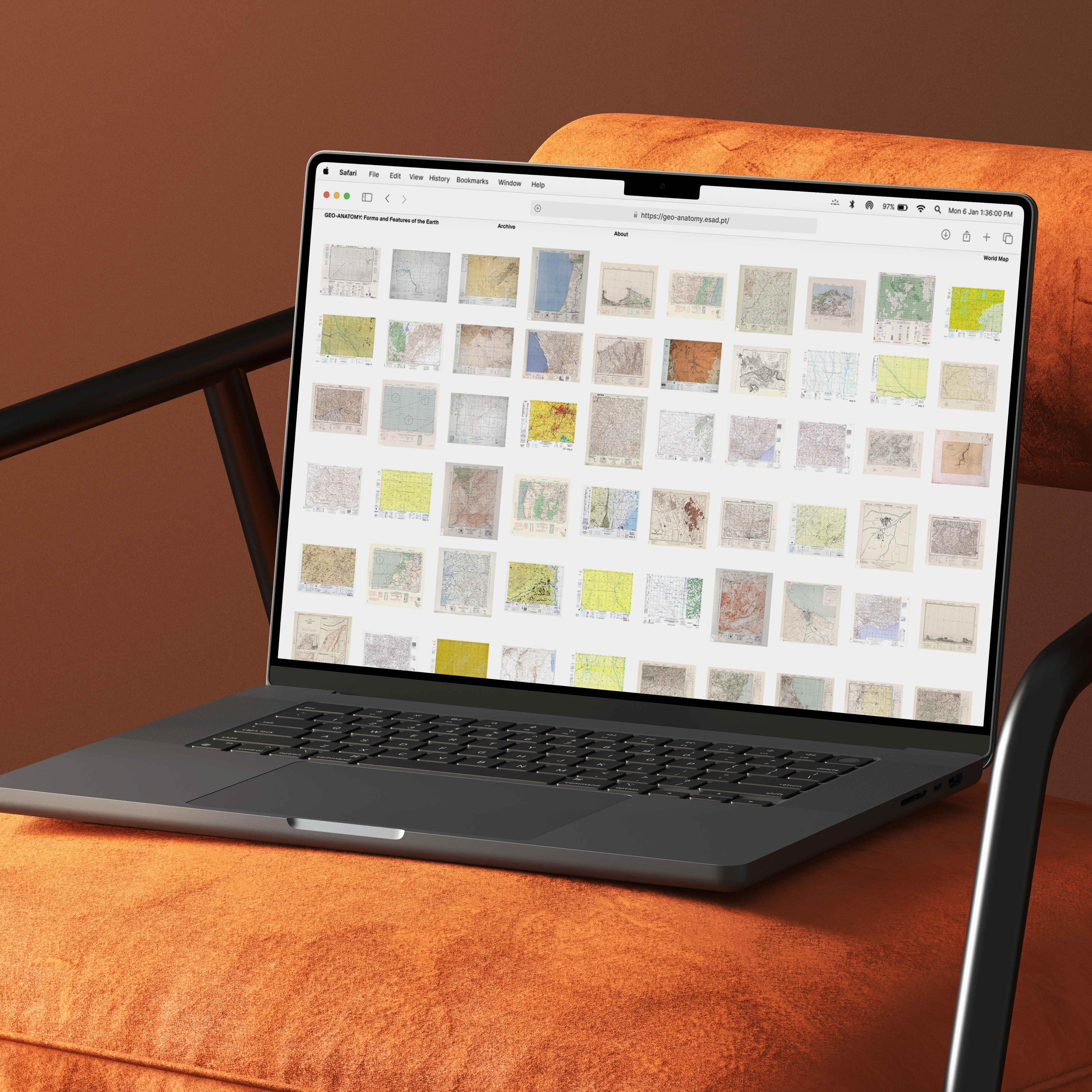
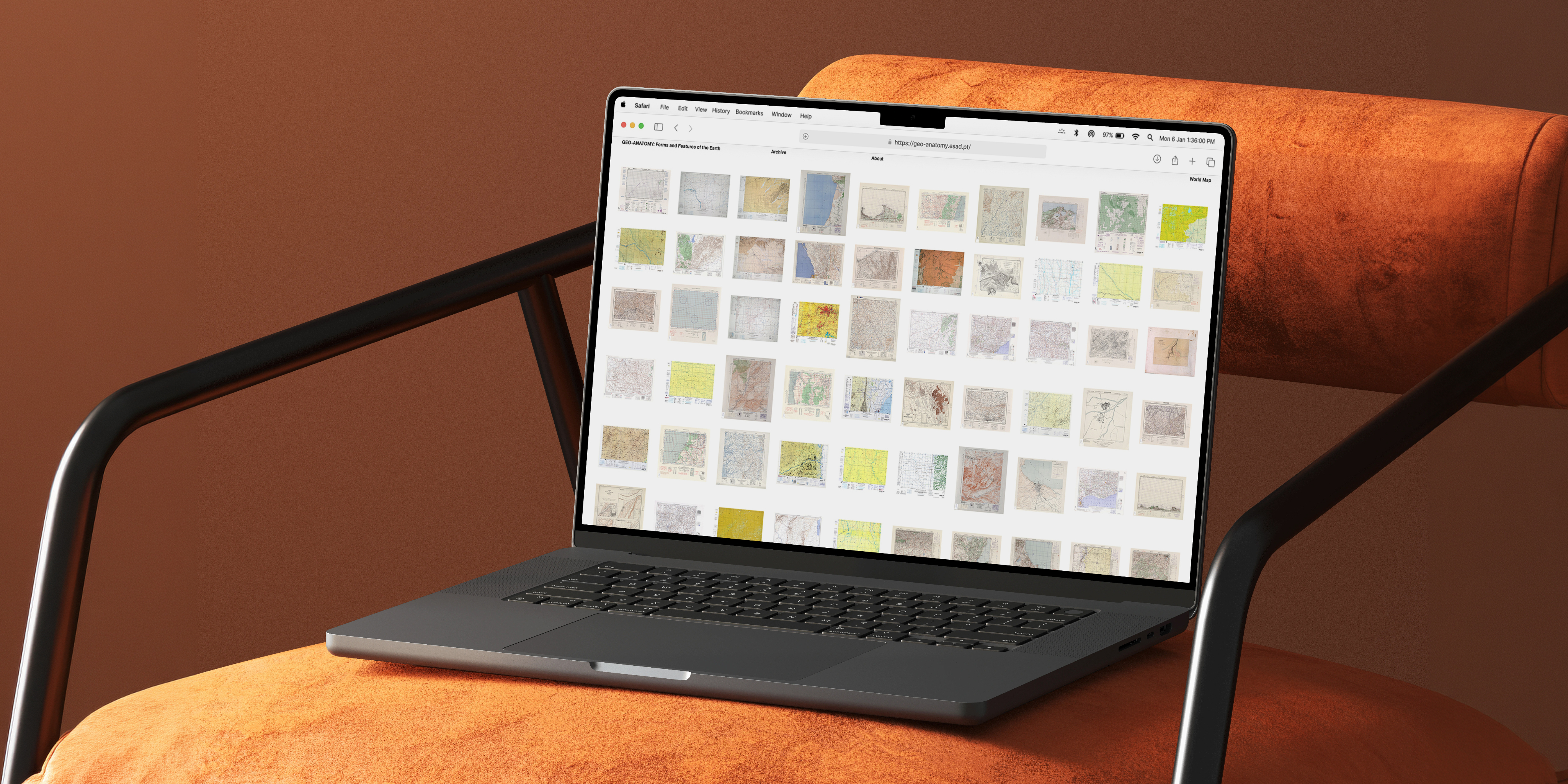
The Evolution of Topographic Mapping takes the form of an atlas exploring how people have represented, studied, and understood the Earth's surfaces over time. The project combines historical research with visual exploration, using topographic mapping as both a subject of study and a source of visual inspiration.
A framework built on decades and regions
The project brings together fundamental concepts of topography with an extensive collection of historical maps, organized by decade and region. This structure creates a clear framework for exploring how mapping techniques, visual conventions and representations of landscapes, have evolved across different periods and geographical contexts.
From team research to solo build
Geo-anatomy was a team project with José Lima, Francisco Fernandes, and Bernardo Alves. Together, we researched and organized the historical map data that powers the atlas. From there, I owned the website end to end, designing, prototyping, and building it independently, while the rest of the team worked on the physical atlas.
More than elevation
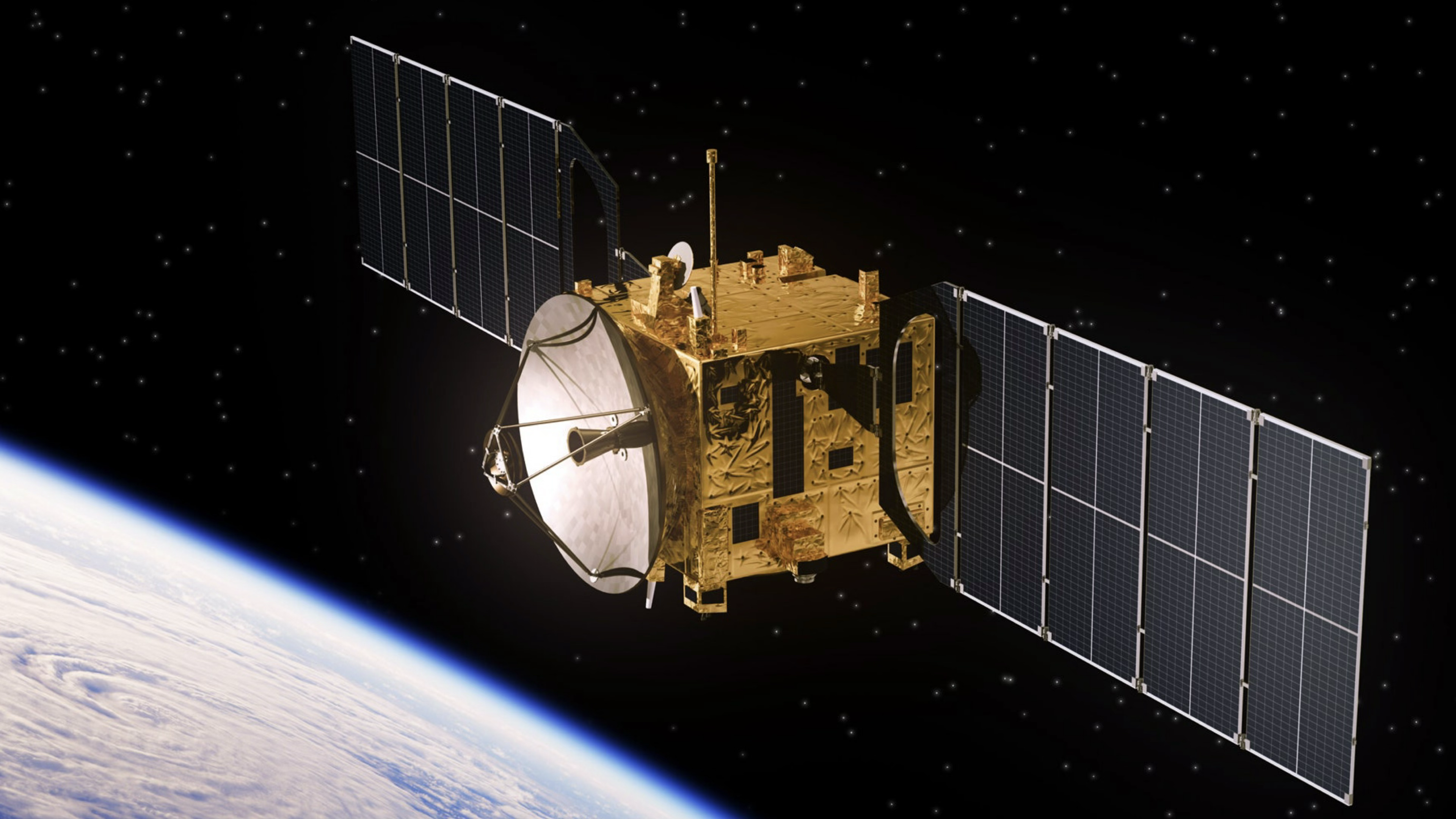
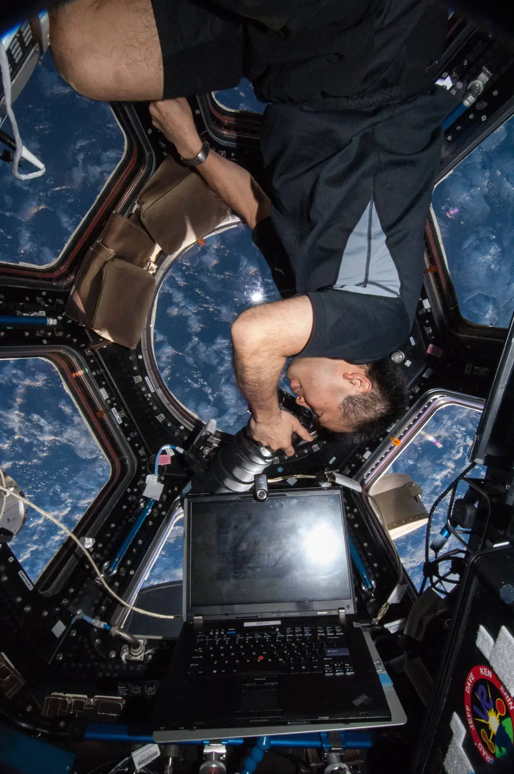
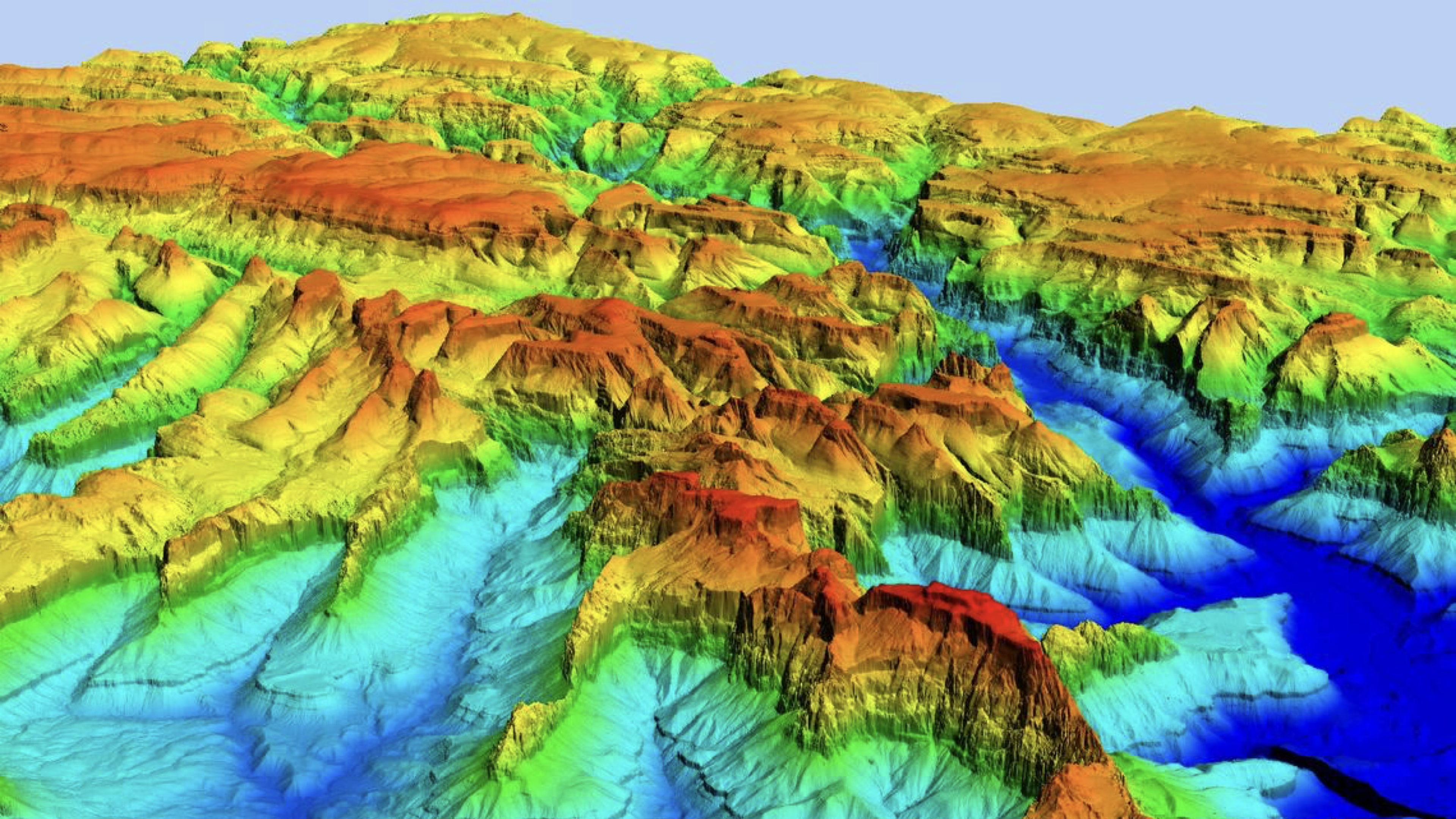
Topography is a field within geoscience and planetary science, and it's concerned with local detail in the broadest sense. That means not just relief, but natural and artificial features, and even the history and culture tied to a place.
A visual language written in contour lines
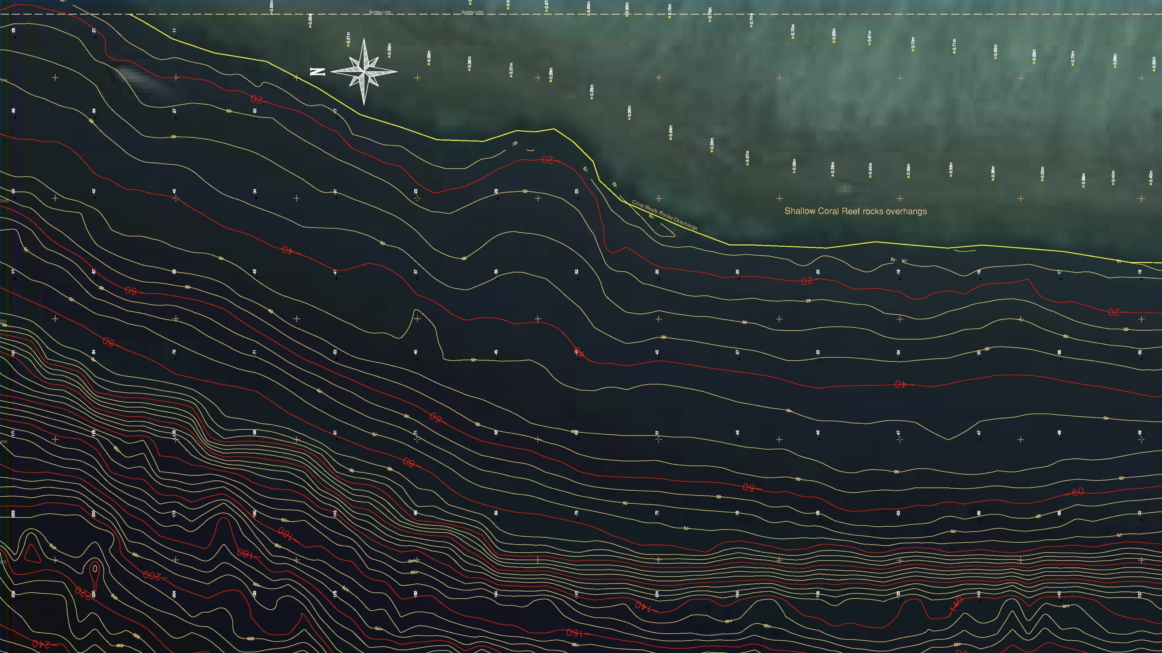
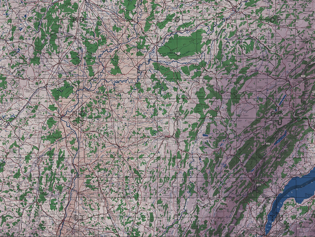
Topographic mapping was chosen for its distinctive graphic and symbolic language. Contour lines, elevation patterns, symbols, grids, and layered information form a recognizable visual vocabulary that shapes the project's identity and creates a strong connection between the subject matter and the interface.
Tools


Designed in
April to March 2021
Accessible without losing depth
The experience is designed for a broad audience with an interest in topography, maps, history, or visual culture. Rather than relying on highly technical or scientific explanations, complex information is translated into clear and approachable content, allowing users to explore the subject without needing any prior knowledge.
Personas and audience needs
To guide the design, four personas were defined, representing different ways users might approach the atlas: map enthusiasts, students, researchers and visually curious visitors. Their different interests and motivations helped shape the balance between accessible content, exploration and deeper research.

Alex
· Designer, 29
Motivations
Discover cultural experiences
Interests
Museums · Photography · Travel
Pain points
Hard-to-find practical information
Frustrations
Too many steps to find opening hours or exhibitions

Sofia
· Geographic student, 21
Motivations
Research printing and visual culture
Interests
Typography · History · Design
Pain points
Too much information without hierarchy
Frustrations
Difficulty finding relevant collections

Daniel
· Researcher, 36
Motivations
Find educational activities
Interests
Workshops · History · Education
Pain points
Educational content is difficult to identify
Frustrations
Searching for program and visit details

Marta
· Creative professional, 26
Motivations
Explore local history and heritage
Interests
Museums · Heritage · Books
Pain points
Dense layouts and unclear navigation
Frustrations
Difficulty knowing where to go next
Room to wander, room to learn
The organization of information encourages curiosity and exploration, giving users the freedom to move through different periods and regions while gradually building an understanding of how topographic mapping has evolved.
Built in Figma, structured in data
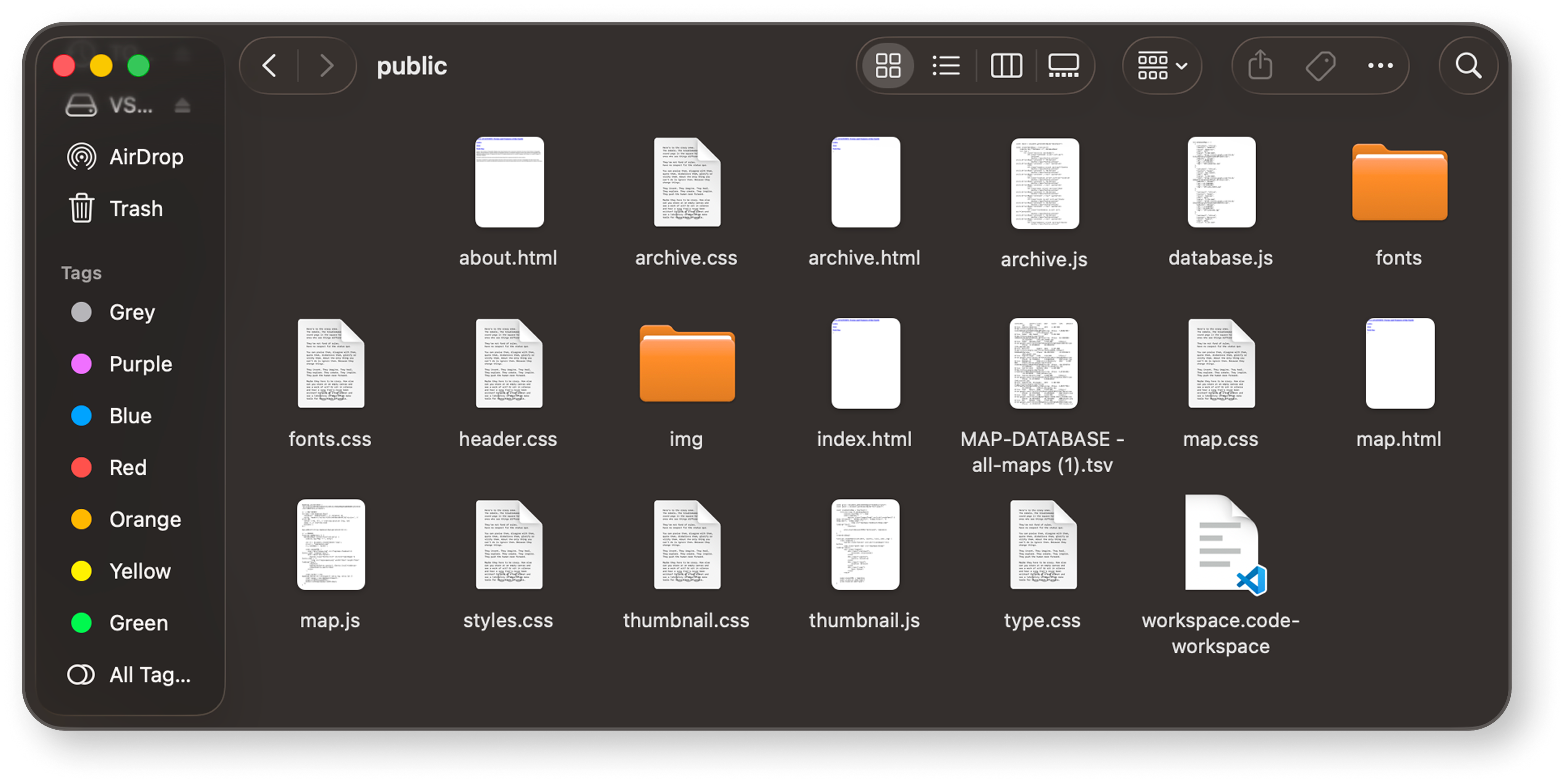
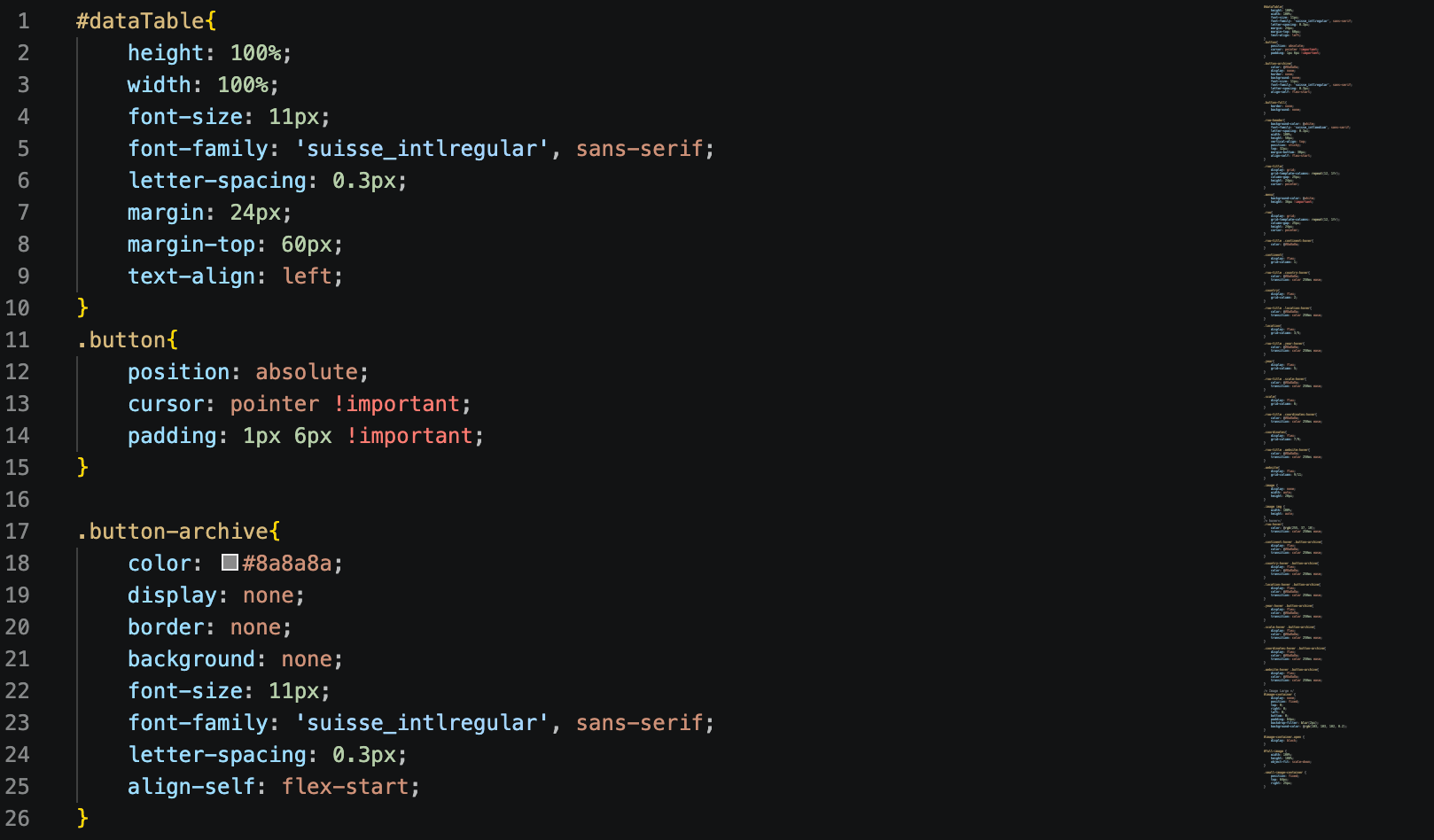
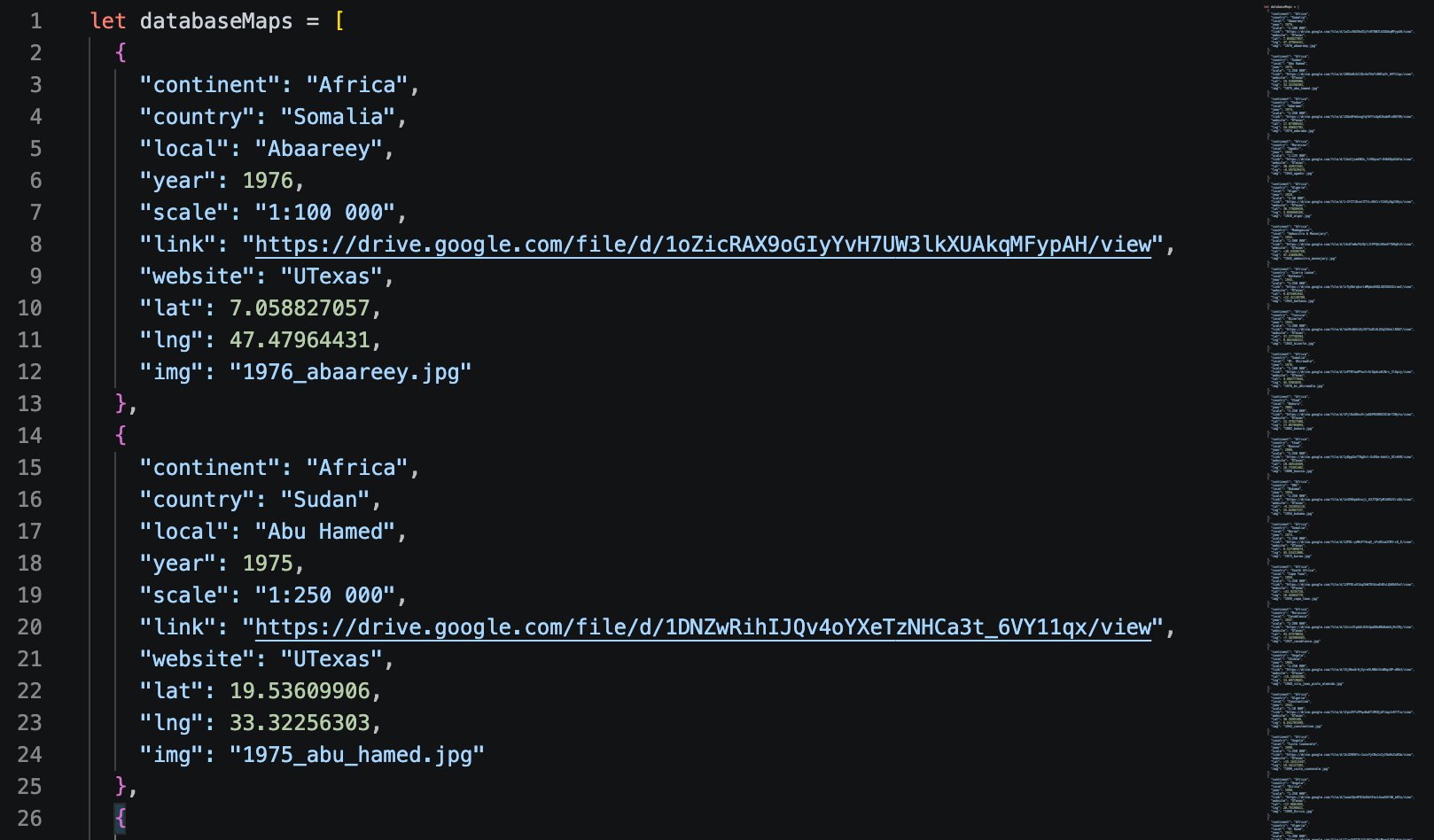
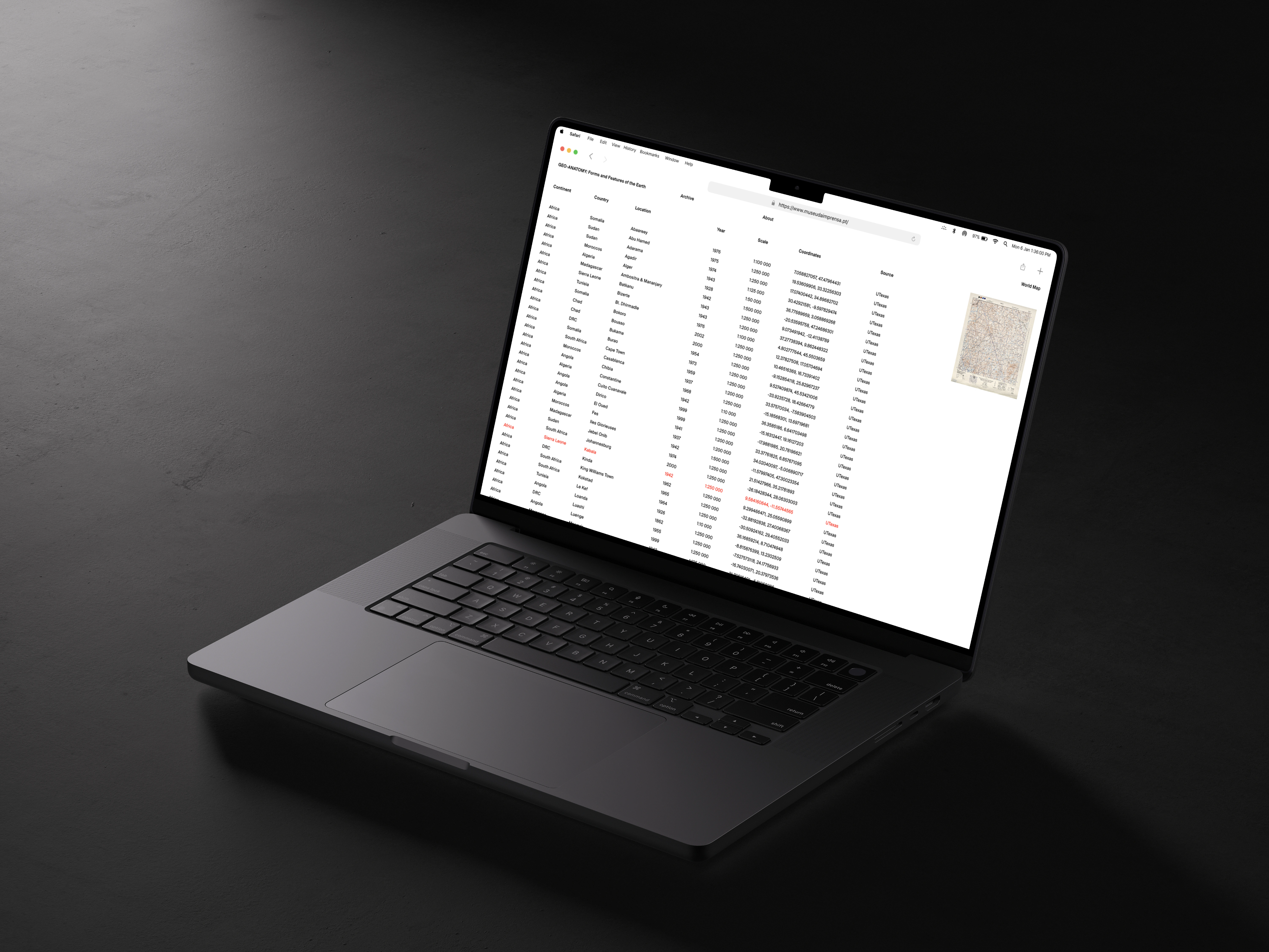
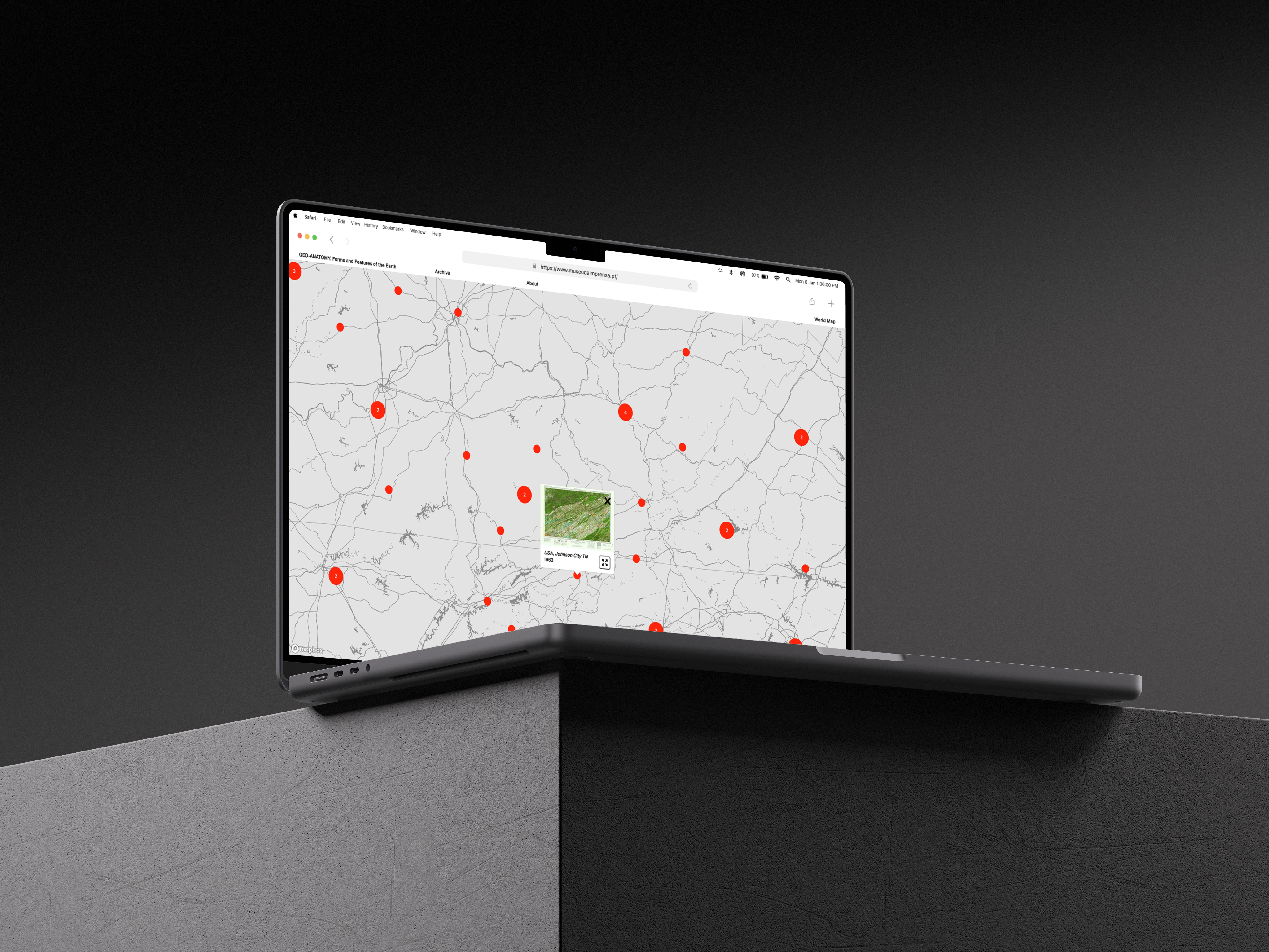
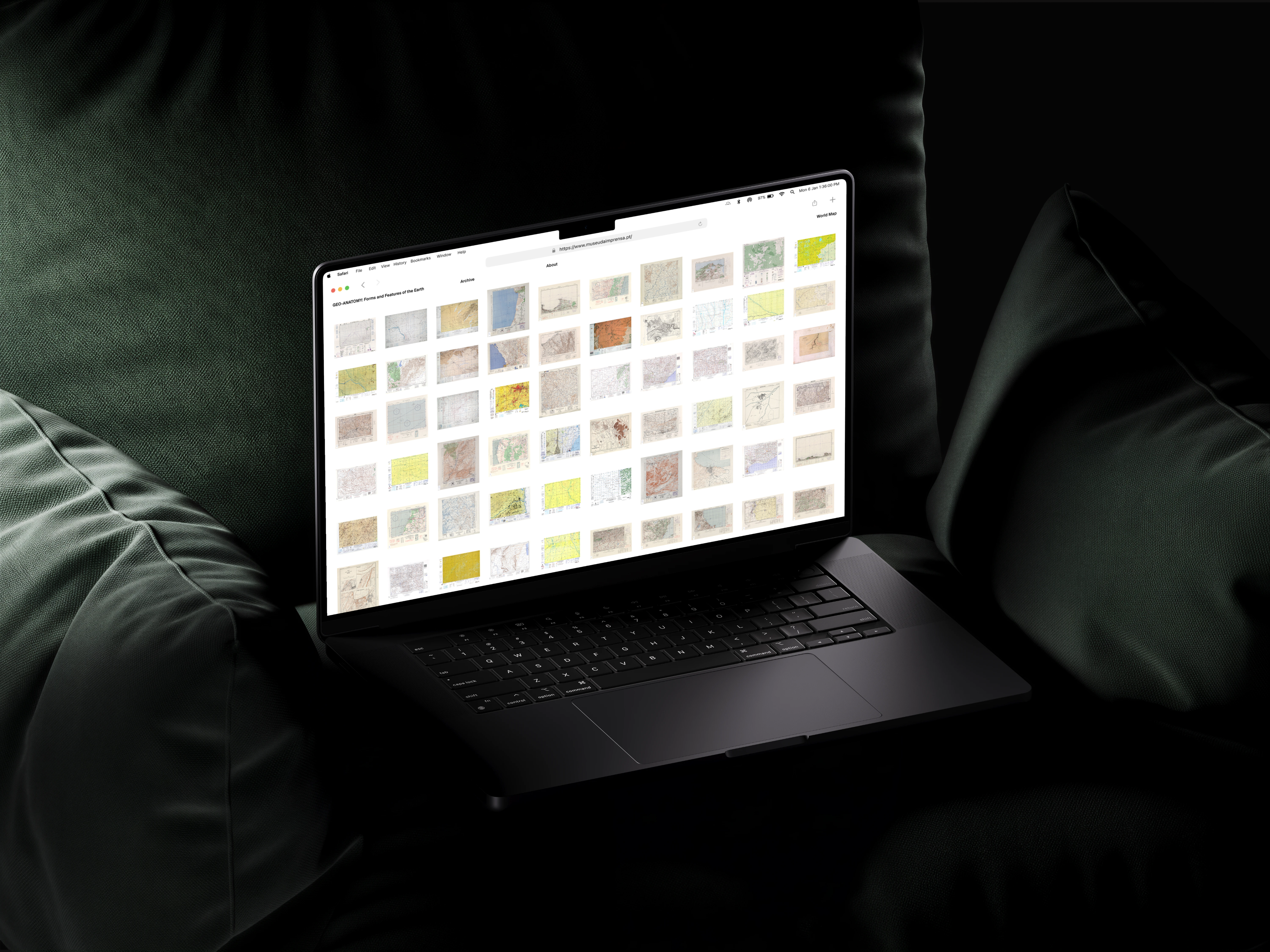
As with the Macintosh project, the design started in Figma, where the layout and prototypes were worked out before any code was written. The build itself is organized around a handful of dedicated pages, an index, an about page, an archive, a map view, and a thumbnail view, each with its own HTML, CSS, and JavaScript. A separate database file pulls from a spreadsheet holding the full collection of historical maps, so the large amount of data behind the project stays organized and easy to update. The whole thing runs on Firebase, which handles hosting and the backend.
What's inside and why it matters?
The atlas invites users to explore the subject from several angles: the forms and features of the Earth, the different forms of geo-data, the many forms of topographic mapping, and the evolution of a map over time. A section on world tops and geo-statistics rounds out the data side, while a glossary and a references archive are there for anyone who wants to dig deeper.
At its core, though, the project explores something simpler: the human desire to represent and understand the surfaces that surround us. By combining research, visual storytelling, and structured information, the atlas turns a specialized subject into an accessible and engaging experience.
See more in https://geo-anatomy.esad.pt/
Filipa Silva
Geo-Anatomy
The Evolution of Topographic Mapping takes the form of an atlas exploring how people have represented, studied, and understood the Earth's surfaces over time. The project combines historical research with visual exploration, using topographic mapping as both a subject of study and a source of visual inspiration.
A framework built on decades and regions
The project brings together fundamental concepts of topography with an extensive collection of historical maps, organized by decade and region. This structure creates a clear framework for exploring how mapping techniques, visual conventions and representations of landscapes, have evolved across different periods and geographical contexts.
From team research to solo build
Geo-anatomy was a team project with José Lima, Francisco Fernandes, and Bernardo Alves. Together, we researched and organized the historical map data that powers the atlas. From there, I owned the website end to end, designing, prototyping, and building it independently, while the rest of the team worked on the physical atlas.
More than elevation
Topography is a field within geoscience and planetary science, and it's concerned with local detail in the broadest sense. That means not just relief, but natural and artificial features, and even the history and culture tied to a place.
A visual language written in contour lines
Topographic mapping was chosen for its distinctive graphic and symbolic language. Contour lines, elevation patterns, symbols, grids, and layered information form a recognizable visual vocabulary that shapes the project's identity and creates a strong connection between the subject matter and the interface.
Tools
Designed in
April to March 2021
Accessible without losing depth
The experience is designed for a broad audience with an interest in topography, maps, history, or visual culture. Rather than relying on highly technical or scientific explanations, complex information is translated into clear and approachable content, allowing users to explore the subject without needing any prior knowledge.
Personas and audience needs
To guide the design, four personas were defined, representing different ways users might approach the atlas: map enthusiasts, students, researchers and visually curious visitors. Their different interests and motivations helped shape the balance between accessible content, exploration and deeper research.
Alex
· Designer, 29
Motivations
Discover historical maps
Interests
Cartography · Geography · Design
Pain points
Complex archives
Frustrations
Difficult navigation
Sofia
· Geographic student, 21
Motivations
Learn through visual resources
Interests
Geography · History · Maps
Pain points
Technical information
Frustrations
Overly academic content
Daniel
· Researcher, 36
Motivations
Explore historical data
Interests
Cartography · History · Data
Pain points
Disorganized archives
Frustrations
Missing context
Marta
· Creative professional, 26
Motivations
Explore maps visually
Interests
Visual culture · Art · History
Pain points
Dense interfaces
Frustrations
Limited exploration paths
Room to wander, room to learn
The organization of information encourages curiosity and exploration, giving users the freedom to move through different periods and regions while gradually building an understanding of how topographic mapping has evolved.
Built in Figma, structured in data
The design started in Figma, where the layout and prototypes were worked out before any code was written. The build itself is organized around a handful of dedicated pages, an index, an about page, an archive, a map view, and a thumbnail view, each with its own HTML, CSS, and JavaScript. A separate database file pulls from a spreadsheet holding the full collection of historical maps, so the large amount of data behind the project stays organized and easy to update. The whole thing runs on Firebase, which handles hosting and the backend.
What's inside and why it matters?
The atlas invites users to explore the subject from several angles: the forms and features of the Earth, the different forms of geo-data, the many forms of topographic mapping, and the evolution of a map over time. A section on world tops and geo-statistics rounds out the data side, while a glossary and a references archive are there for anyone who wants to dig deeper.
At its core, though, the project explores something simpler: the human desire to represent and understand the surfaces that surround us. By combining research, visual storytelling, and structured information, the atlas turns a specialized subject into an accessible and engaging experience.
See more in https://geo-anatomy.esad.pt/
Filipa Silva
Geo-Anatomy
The Evolution of Topographic Mapping takes the form of an atlas exploring how people have represented, studied, and understood the Earth's surfaces over time. The project combines historical research with visual exploration, using topographic mapping as both a subject of study and a source of visual inspiration.
A framework built on decades and regions
The project brings together fundamental concepts of topography with an extensive collection of historical maps, organized by decade and region. This structure creates a clear framework for exploring how mapping techniques, visual conventions and representations of landscapes, have evolved across different periods and geographical contexts.
From team research to solo build
Geo-anatomy was a team project with José Lima, Francisco Fernandes, and Bernardo Alves. Together, we researched and organized the historical map data that powers the atlas. From there, I owned the website end to end, designing, prototyping, and building it independently, while the rest of the team worked on the physical atlas.
More than elevation
Topography is a field within geoscience and planetary science, and it's concerned with local detail in the broadest sense. That means not just relief, but natural and artificial features, and even the history and culture tied to a place.
A visual language written in contour lines
Topographic mapping was chosen for its distinctive graphic and symbolic language. Contour lines, elevation patterns, symbols, grids, and layered information form a recognizable visual vocabulary that shapes the project's identity and creates a strong connection between the subject matter and the interface.
Tools
Designed in
April to March 2021
Accessible without losing depth
The experience is designed for a broad audience with an interest in topography, maps, history, or visual culture. Rather than relying on highly technical or scientific explanations, complex information is translated into clear and approachable content, allowing users to explore the subject without needing any prior knowledge.
Personas and audience needs
To guide the design, four personas were defined, representing different ways users might approach the atlas: map enthusiasts, students, researchers and visually curious visitors. Their different interests and motivations helped shape the balance between accessible content, exploration and deeper research.
User
Motivation
Interests
Pain points
Frustrations
Alex
Designer, 29
Discover historical maps
Cartography · Geography · Design
Complex archives
Difficult navigation
Sofia
Geography student, 21
Learn through visual resources
Geography · History · Maps
Technical information
Overly academic content
Daniel
Researcher, 38
Explore historical data
Cartography · History · Data
Disorganized archives
Missing context
Marta
Creative professional, 26
Explore maps visually
Visual culture · Art · History
Dense interfaces
Limited exploration paths
Room to wander, room to learn
The organization of information encourages curiosity and exploration, giving users the freedom to move through different periods and regions while gradually building an understanding of how topographic mapping has evolved.
Built in Figma, structured in data
The design started in Figma, where the layout and prototypes were worked out before any code was written. The build itself is organized around a handful of dedicated pages, an index, an about page, an archive, a map view, and a thumbnail view, each with its own HTML, CSS, and JavaScript. A separate database file pulls from a spreadsheet holding the full collection of historical maps, so the large amount of data behind the project stays organized and easy to update. The whole thing runs on Firebase, which handles hosting and the backend.
What's inside and why it matters?
The atlas invites users to explore the subject from several angles: the forms and features of the Earth, the different forms of geo-data, the many forms of topographic mapping, and the evolution of a map over time. A section on world tops and geo-statistics rounds out the data side, while a glossary and a references archive are there for anyone who wants to dig deeper.
At its core, though, the project explores something simpler: the human desire to represent and understand the surfaces that surround us. By combining research, visual storytelling, and structured information, the atlas turns a specialized subject into an accessible and engaging experience.
See more in https://geo-anatomy.esad.pt/
Filipa Silva
Geo-Anatomy
The Evolution of Topographic Mapping takes the form of an atlas exploring how people have represented, studied, and understood the Earth's surfaces over time. The project combines historical research with visual exploration, using topographic mapping as both a subject of study and a source of visual inspiration.
A framework built on decades and regions
The project brings together fundamental concepts of topography with an extensive collection of historical maps, organized by decade and region. This structure creates a clear framework for exploring how mapping techniques, visual conventions and representations of landscapes, have evolved across different periods and geographical contexts.
From team research to solo build
Geo-anatomy was a team project with José Lima, Francisco Fernandes and Bernardo Alves. Together, we researched and organized the historical map data that powers the atlas. From there, I took ownership of the website on my own, handling the design, prototyping and development, while the rest of the team focused on building the physical atlas.
More than elevation
Topography is a field within geoscience and planetary science, and it's concerned with local detail in the broadest sense. That means not just relief, but natural and artificial features, and even the history and culture tied to a place.
A visual language written in contour lines
Topographic mapping was chosen for its distinctive graphic and symbolic language. Contour lines, elevation patterns, symbols, grids, and layered information form a recognizable visual vocabulary that shapes the project's identity and creates a strong connection between the subject matter and the interface.
Tools
Designed in
April to March 2021
Accessible without losing depth
The experience is designed for a broad audience with an interest in topography, maps, history, or visual culture. Rather than relying on highly technical or scientific explanations, complex information is translated into clear and approachable content, allowing users to explore the subject without needing any prior knowledge.
Personas and audience needs
To guide the design, four personas were defined, representing different ways users might approach the atlas: map enthusiasts, students, researchers and visually curious visitors. Their different interests and motivations helped shape the balance between accessible content, exploration and deeper research.
User
Motivation
Interests
Pain points
Frustrations
Alex
Designer, 29
Discover historical maps
Cartography · Geography · Design
Complex archives
Difficult navigation
Sofia
Geography student, 21
Learn through visual resources
Geography · History · Maps
Technical information
Overly academic content
Daniel
Researcher, 38
Explore historical data
Cartography · History · Data
Disorganized archives
Missing context
Marta
Creative professional, 26
Explore maps visually
Visual culture · Art · History
Dense interfaces
Limited exploration paths
Room to wander, room to learn
The organization of information encourages curiosity and exploration, giving users the freedom to move through different periods and regions while gradually building an understanding of how topographic mapping has evolved.
Built in Figma, structured in data
The design started in Figma, where the layout and prototypes were worked out before any code was written. The build itself is organized around a handful of dedicated pages, an index, an about page, an archive, a map view, and a thumbnail view, each with its own HTML, CSS, and JavaScript. A separate database file pulls from a spreadsheet holding the full collection of historical maps, so the large amount of data behind the project stays organized and easy to update. The whole thing runs on Firebase, which handles hosting and the backend.
What's inside and why it matters?
The atlas invites users to explore the subject from several angles: the forms and features of the Earth, the different forms of geo-data, the many forms of topographic mapping, and the evolution of a map over time. A section on world tops and geo-statistics rounds out the data side, while a glossary and a references archive are there for anyone who wants to dig deeper.
At its core, though, the project explores something simpler: the human desire to represent and understand the surfaces that surround us. By combining research, visual storytelling, and structured information, the atlas turns a specialized subject into an accessible and engaging experience.
See more in https://geo-anatomy.esad.pt/