
Go back
Museu Nacional da Imprensa
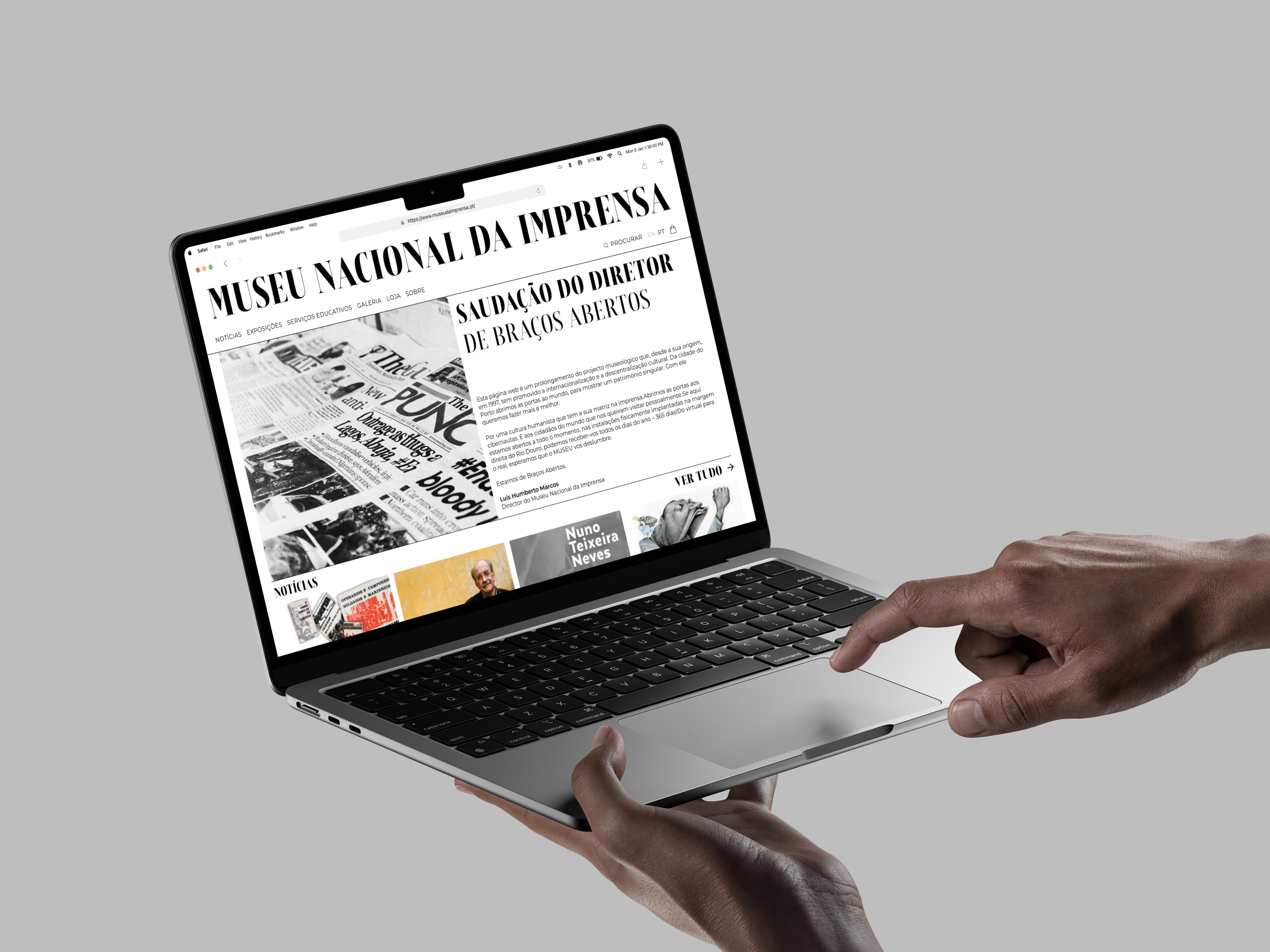
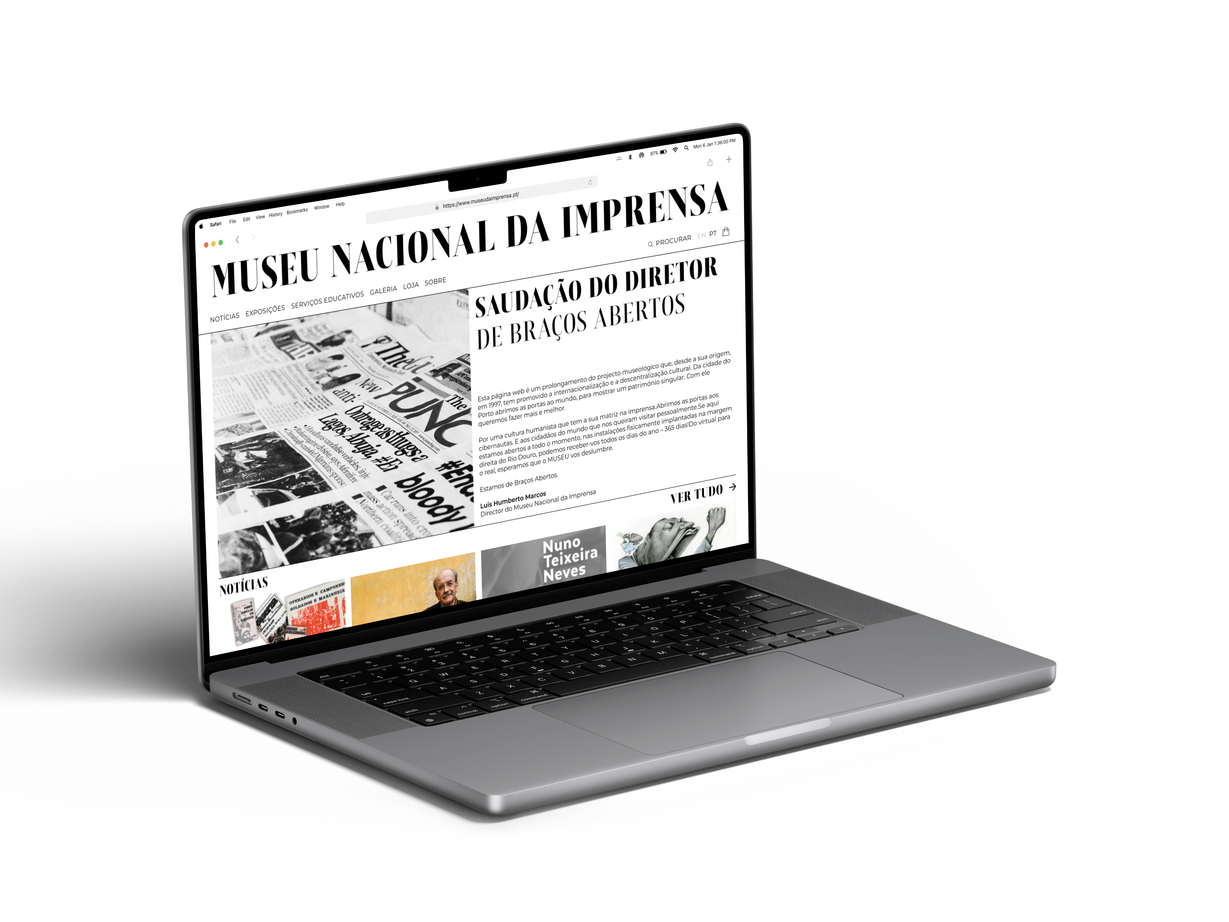
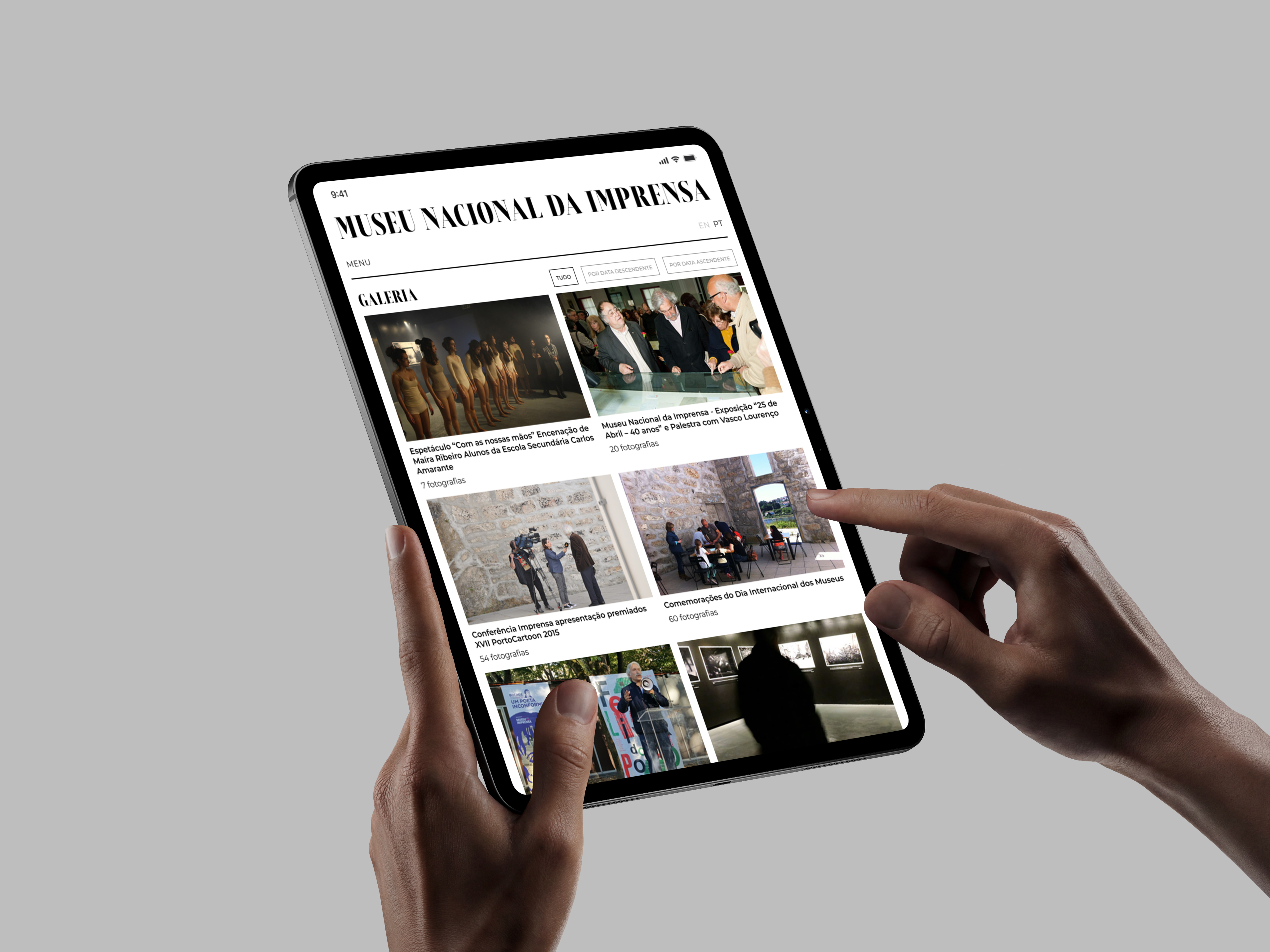
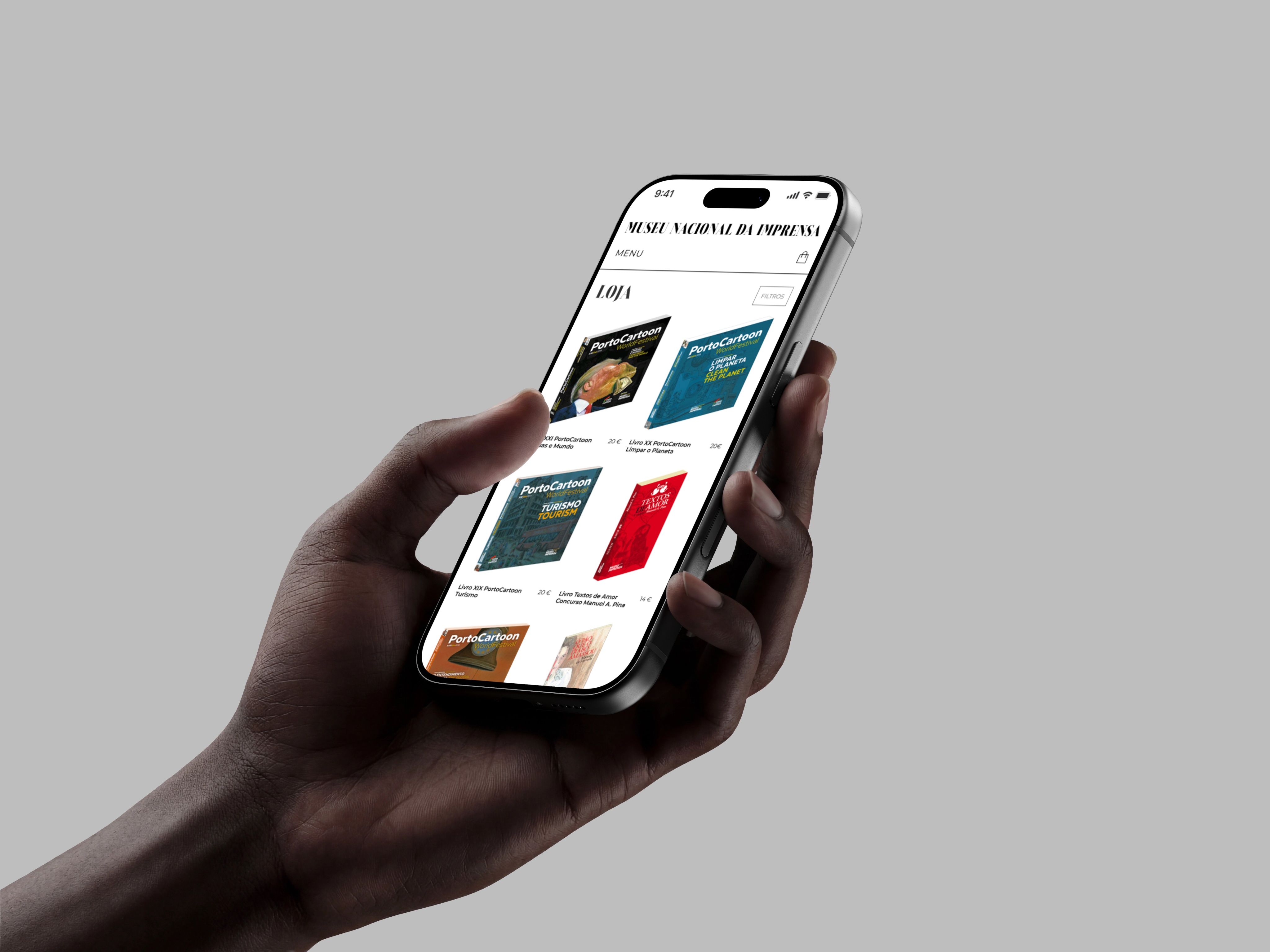
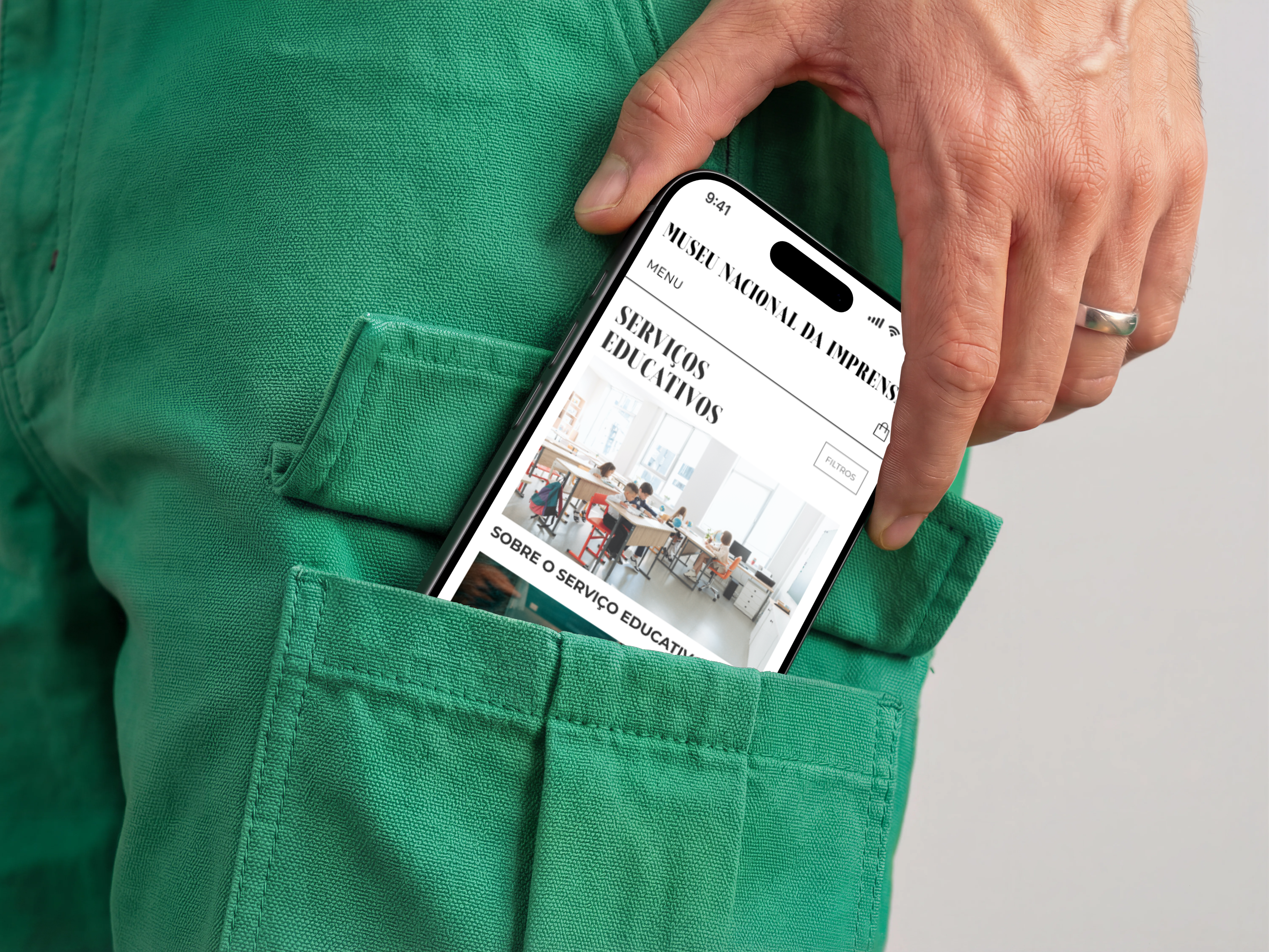
The rebrand of the Museu Nacional da Imprensa website, focuses on translating the museum's cultural identity into a contemporary digital experience. With a collection spanning the history of printing, typography, graphic arts, and cartoon, the redesign aims to make this extensive cultural heritage more accessible, engaging,and relevant to today's audiences.
A visual identity built to hold it all
The visual direction draws inspiration from the museum's connection to printing, typography and graphic communication. Historical references are reinterpreted through a contemporary interface, creating a balance between heritage and modernity, while keeping the museum's content and collections at the centre of the experience.
A key challenge was structuring that extensive range of content into a clear and intuitive experience. Exhibitions, collections, history, educational programs, virtual galleries, events and visitor information, are organized into a coherent structure, making it easier for users to navigate and discover relevant content.
Tools


Designed in
April 2023
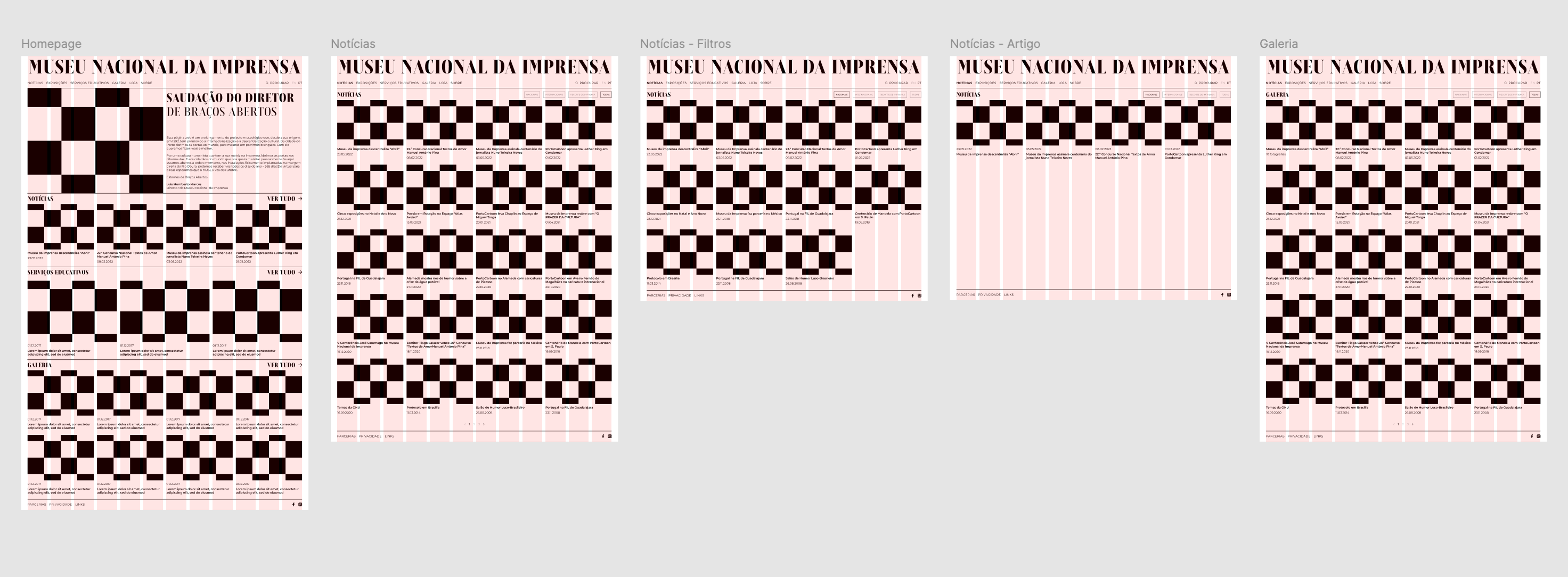
Low-fidelity wireframes.
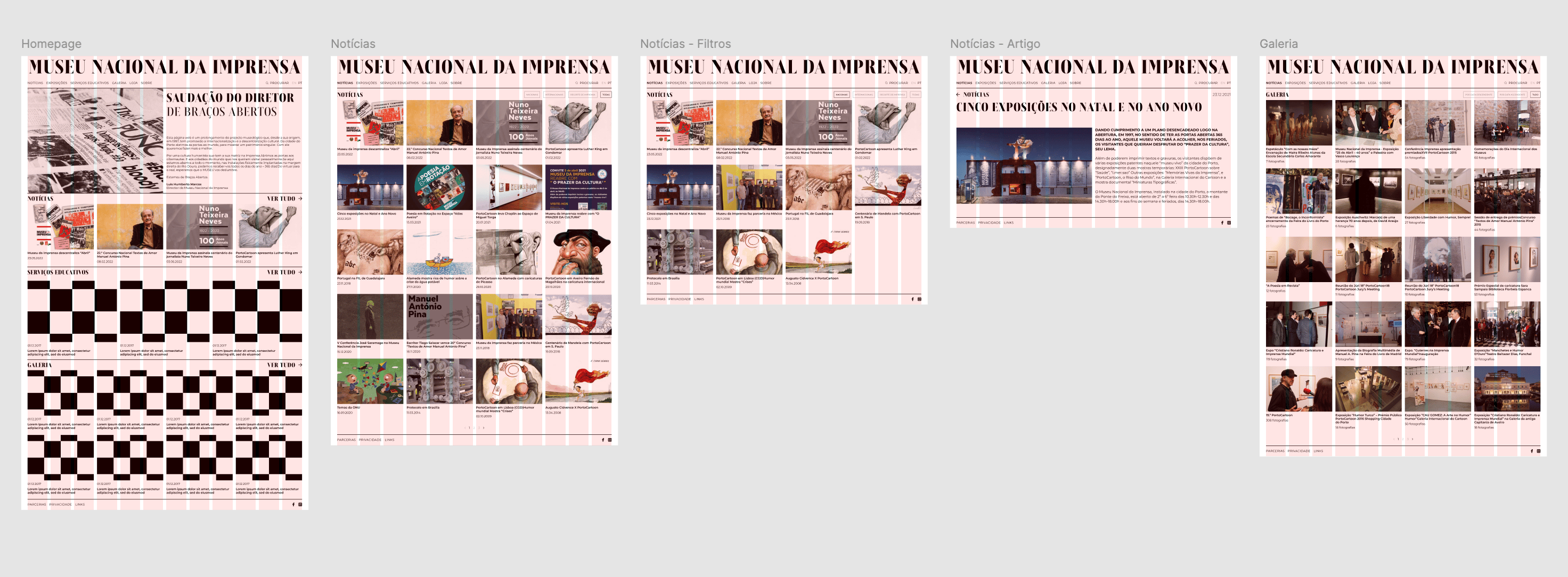
Medium-fidelity wireframes.
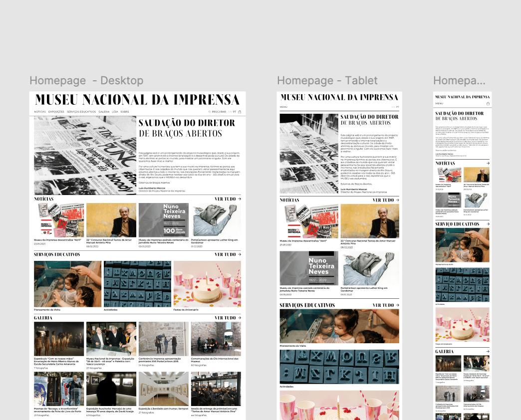
High-fidelity wireframes.
From audit to final design
Every part of this redesign was mine to handle, from the initial audit of the existing site to the final prototype. The process began with a review of the current website, identifying what was working well and what could be improved. From there, I moved into wireframes in Figma, followed by the design itself and its prototyping.
I also defined four key personas representing the museum's main audiences, tourists, students, educators and cultural visitors, using their different needs and motivations to guide the site's structure and content priorities.
Inês
· Marketing professional, 34
Motivations
Discover cultural experiences
Interests
Museums · Photography · Travel
Pain points
Hard-to-find practical information
Frustrations
Too many steps to find opening hours or exhibitions
Miguel
· University student, 21
Motivations
Discover cultural experiences
Interests
Typography · History · Design
Pain points
Too much information without hierarchy
Frustrations
Difficulty finding relevant collections
Carla
· Educator, 42
Motivations
Research printing and visual culture
Interests
Workshops · History · Education
Pain points
Educational content is difficult to identify
Frustrations
Searching for program and visit details

João
· Retired, 67
Motivations
Explore local history and heritage
Interests
Museums · Heritage · Books
Pain points
Dense layouts and unclear navigation
Frustrations
Difficulty knowing where to go next
Built for everyone who walks in
The redesign considers the museum's diverse audiences, including families, students, educators, researchers, tourists and general visitors, and how each group is likely to use the site, from planning a visit and discovering exhibitions to exploring collections and educational content. Key tasks such as finding opening hours, location, and program information guided the information architecture, creating clearer pathways between practical visitor information and deeper editorial content that supports both quick visits and longer exploration.
The museum, continued online
The rebrand positions the Museu Nacional da Imprensa's digital presence as an extension of the museum itself, a space where cultural heritage, education and contemporary communication come together. By combining a visual identity rooted in the history of printing with a clearer information architecture, the project creates a more accessible and engaging platform for discovering, understanding and exploring the museum's content.
Filipa Silva
Museu Nacional da Imprensa
The rebrand of the Museu Nacional da Imprensa website, focuses on translating the museum's cultural identity into a contemporary digital experience. With a collection spanning the history of printing, typography, graphic arts, and cartoon, the redesign aims to make this extensive cultural heritage more accessible, engaging,and relevant to today's audiences.
A visual identity built to hold it all
The visual direction draws inspiration from the museum's connection to printing, typography and graphic communication. Historical references are reinterpreted through a contemporary interface, creating a balance between heritage and modernity, while keeping the museum's content and collections at the centre of the experience.
A key challenge was structuring that extensive range of content into a clear and intuitive experience. Exhibitions, collections, history, educational programs, virtual galleries, events and visitor information, are organized into a coherent structure, making it easier for users to navigate and discover relevant content.
Tools
Designed in
April 2023
Low-fidelity wireframes.
Medium-fidelity wireframes.
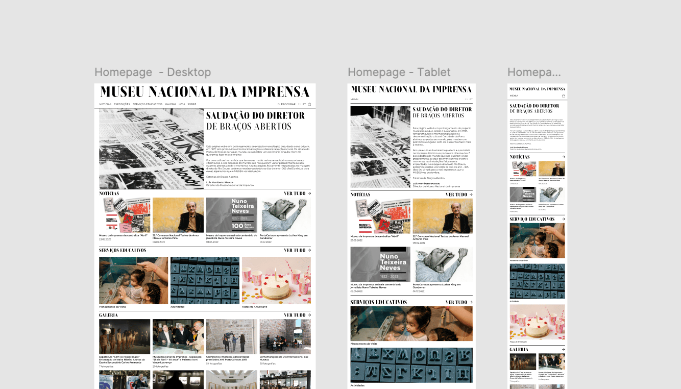
High-fidelity wireframes.
From audit to final design
Every part of this redesign was mine to handle, from the initial audit of the existing site to the final prototype. The process began with a review of the current website, identifying what was working well and what could be improved. From there, I moved into wireframes in Figma, followed by the design itself and its prototyping.
I also defined four key personas representing the museum's main audiences, tourists, students, educators and cultural visitors, using their different needs and motivations to guide the site's structure and content priorities.
Inês
· Marketing professional, 34
Motivations
Discover cultural experiences
Interests
Museums · Photography · Travel
Pain points
Hard-to-find practical information
Frustrations
Too many steps to find opening hours or exhibitions
Miguel
· University student, 21
Motivations
Research printing and visual culture
Interests
Typography · History · Design
Pain points
Too much information without hierarchy
Frustrations
Difficulty finding relevant collections
Carla
· Educator, 42
Motivations
Find educational activities
Interests
Workshops · History · Education
Pain points
Educational content is difficult to identify
Frustrations
Searching for program and visit details
João
· Retired, 67
Motivations
Explore local history and heritage
Interests
Museums · Heritage · Books
Pain points
Dense layouts and unclear navigation
Frustrations
Difficulty knowing where to go next
Built for everyone who walks in
The redesign considers the museum's diverse audiences, including families, students, educators, researchers, tourists and general visitors, and how each group is likely to use the site, from planning a visit and discovering exhibitions to exploring collections and educational content. Key tasks such as finding opening hours, location, and program information guided the information architecture, creating clearer pathways between practical visitor information and deeper editorial content that supports both quick visits and longer exploration.
The museum, continued online
The rebrand positions the Museu Nacional da Imprensa's digital presence as an extension of the museum itself, a space where cultural heritage, education and contemporary communication come together. By combining a visual identity rooted in the history of printing with a clearer information architecture, the project creates a more accessible and engaging platform for discovering, understanding and exploring the museum's content.
Filipa Silva
Museu Nacional da Imprensa
The rebrand of the Museu Nacional da Imprensa website, focuses on translating the museum's cultural identity into a contemporary digital experience. With a collection spanning the history of printing, typography, graphic arts, and cartoon, the redesign aims to make this extensive cultural heritage more accessible, engaging,and relevant to today's audiences.
A visual identity built to hold it all
The visual direction draws inspiration from the museum's connection to printing, typography and graphic communication. Historical references are reinterpreted through a contemporary interface, creating a balance between heritage and modernity, while keeping the museum's content and collections at the centre of the experience.
A key challenge was structuring that extensive range of content into a clear and intuitive experience. Exhibitions, collections, history, educational programs, virtual galleries, events and visitor information, are organized into a coherent structure, making it easier for users to navigate and discover relevant content.
Tools
Designed in
April 2023
Low-fidelity wireframes.
High-fidelity wireframes.
From audit to final design
Every part of this redesign was mine to handle, from the initial audit of the existing site to the final prototype. The process began with a review of the current website, identifying what was working well and what could be improved. From there, I moved into wireframes in Figma, followed by the design itself and its prototyping.
I also defined four key personas representing the museum's main audiences, tourists, students, educators and cultural visitors, using their different needs and motivations to guide the site's structure and content priorities.
User
Motivation
Interests
Pain points
Frustrations
Inês
Marketing professional, 34
Discover cultural experiences
Museums · Photography · Travel
Hard-to-find practical information
Too many steps to find opening hours or exhibitions
Miguel
University student, 21
Research printing and visual culture
Typography · History · Design
Too much information without hierarchy
Difficulty finding relevant collections
Carla
Educator, 42
Find educational activities
Workshops · History · Education
Educational content is difficult to identify
Searching for program and visit details
João
Retired, 67
Explore local history and heritage
Museums · Heritage · Books
Dense layouts and unclear navigation
Difficulty knowing where to go next
Built for everyone who walks in
The redesign considers the museum's diverse audiences, including families, students, educators, researchers, tourists and general visitors, and how each group is likely to use the site, from planning a visit and discovering exhibitions to exploring collections and educational content. Key tasks such as finding opening hours, location, and program information guided the information architecture, creating clearer pathways between practical visitor information and deeper editorial content that supports both quick visits and longer exploration.
The museum, continued online
The rebrand positions the Museu Nacional da Imprensa's digital presence as an extension of the museum itself, a space where cultural heritage, education and contemporary communication come together. By combining a visual identity rooted in the history of printing with a clearer information architecture, the project creates a more accessible and engaging platform for discovering, understanding and exploring the museum's content.
Filipa Silva
Museu Nacional da Imprensa
The rebrand of the Museu Nacional da Imprensa website, focuses on translating the museum's cultural identity into a contemporary digital experience. With a collection spanning the history of printing, typography, graphic arts, and cartoon, the redesign aims to make this extensive cultural heritage more accessible, engaging,and relevant to today's audiences.
A visual identity built to hold it all
The visual direction draws inspiration from the museum's connection to printing, typography and graphic communication. Historical references are reinterpreted through a contemporary interface, creating a balance between heritage and modernity, while keeping the museum's content and collections at the centre of the experience.
A key challenge was structuring that extensive range of content into a clear and intuitive experience. Exhibitions, collections, history, educational programs, virtual galleries, events and visitor information, are organized into a coherent structure, making it easier for users to navigate and discover relevant content.
Tools
Designed in
April 2023
Low-fidelity wireframes.
High-fidelity wireframes.
From audit to final design
Every part of this redesign was mine to handle, from the initial audit of the existing site to the final prototype. The process began with a review of the current website, identifying what was working well and what could be improved. From there, I moved into wireframes in Figma, followed by the design itself and its prototyping.
I also defined four key personas representing the museum's main audiences, tourists, students, educators and cultural visitors, using their different needs and motivations to guide the site's structure and content priorities.
User
Motivation
Interests
Pain points
Frustrations
Inês
Marketing professional, 34
Discover cultural experiences
Museums · Photography · Travel
Hard-to-find practical information
Too many steps to find opening hours or exhibitions
Miguel
University student, 21
Research printing and visual culture
Typography · History · Design
Too much information without hierarchy
Difficulty finding relevant collections
Carla
Educator, 42
Find educational activities
Workshops · History · Education
Educational content is difficult to identify
Searching for program and visit details
João
Retired, 67
Explore local history and heritage
Museums · Heritage · Books
Dense layouts and unclear navigation
Difficulty knowing where to go next
Built for everyone who walks in
The redesign considers the museum's diverse audiences, including families, students, educators, researchers, tourists and general visitors, and how each group is likely to use the site, from planning a visit and discovering exhibitions to exploring collections and educational content. Key tasks such as finding opening hours, location, and program information guided the information architecture, creating clearer pathways between practical visitor information and deeper editorial content that supports both quick visits and longer exploration.
The museum, continued online
The rebrand positions the Museu Nacional da Imprensa's digital presence as an extension of the museum itself, a space where cultural heritage, education and contemporary communication come together. By combining a visual identity rooted in the history of printing with a clearer information architecture, the project creates a more accessible and engaging platform for discovering, understanding and exploring the museum's content.